


 On 11th May, Instagram unveiled it’s rebranded identity, which includes it’s brand colors, colorful gradient and the logo form, and we feel it’s deceptively similar to our branding.
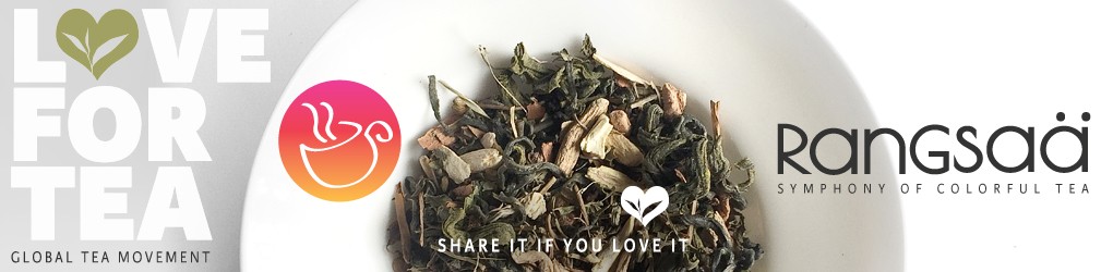
We at Love for Tea love graphic design and our visual narrative across all platforms has been designed, keeping the smooth harmony of colors and flavors in mind. This symbolises Rangsaa’s tagline – ‘Symphony of colorful tea‘. Our design decisions are aligned to the unique tea experience that we offer through our teas. The colorful gradient depicts the transition of moods through the elevation of various senses. And we love experimenting with it.
Rangsaa is a Global Tea Movement and we developed our designs to connect with our target audience. We talk about experiential design, where color gradients support our tea blend’s symbol/motif in white. Our brand language is influenced by minimalistic and contemporary style.
We got our branding done by a leading graphic designer in 2012 and we hold the trademark for our identity. We don’t want our users to get confused or be mislead. A logo is a unique signature and intellectual property of a brand and it’s use without prior consent can invite trouble. Companies need to be very careful when getting their branding designed. Branding includes the colors, logos, typefaces, icons etc of the brand. Everything that a user would relate to and develop a connect.
Companies should make sure that they accidentally don’t infringe upon an existing registered logo design which can invite unnecessary confusion.
If you think that Instagram’s new branding and identity is deceptively similar to ours, please show your support and participate in the poll below.
Thank you, Team Love for Tea.
LikeLike